

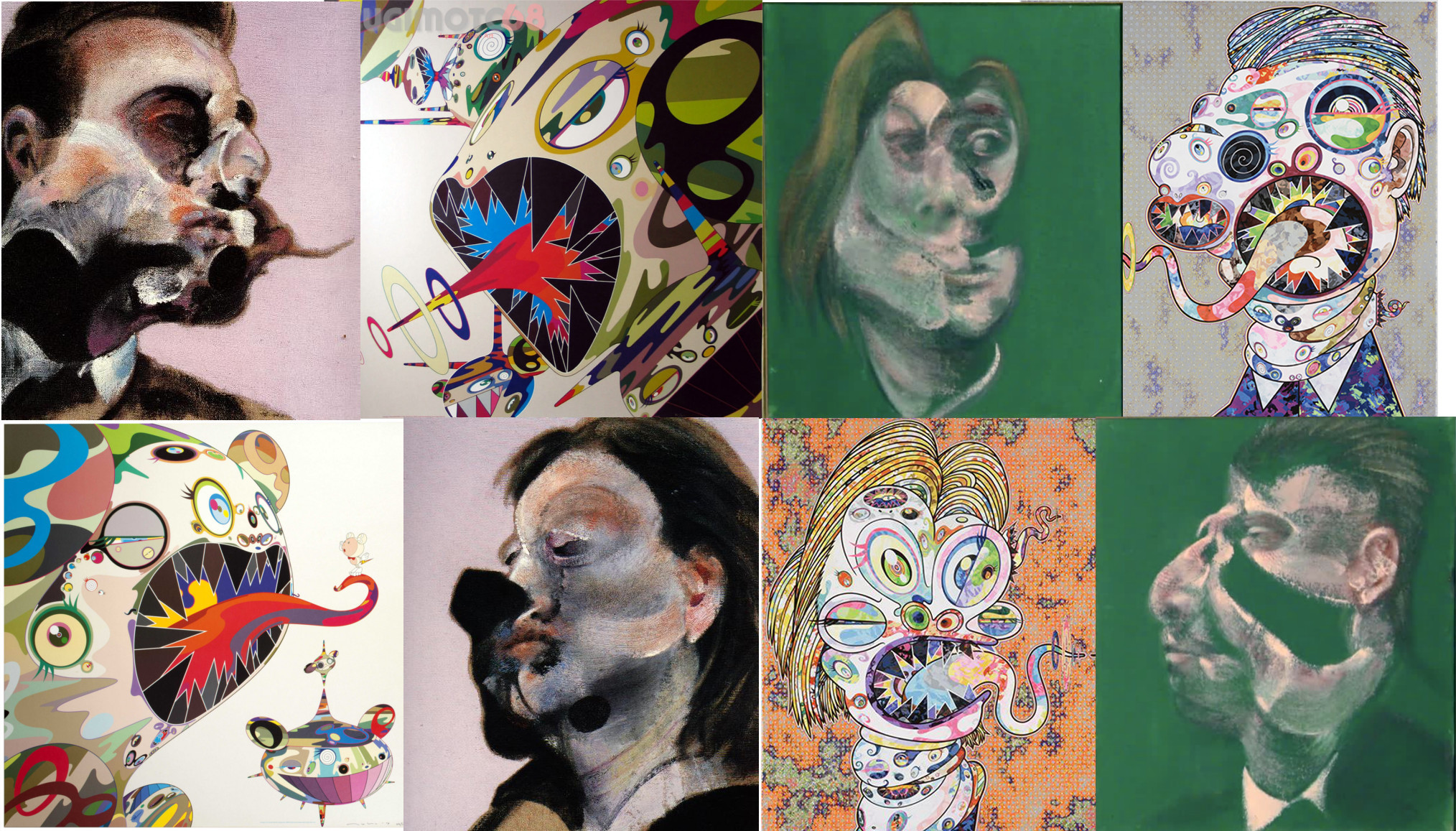
When my clients started pointing out errors in my Francis Bacon listings, a disambiguation article began to emerge—for my own sake! This guide will provide a brief blueprint of the Murakami Francis Bacon series of prints.
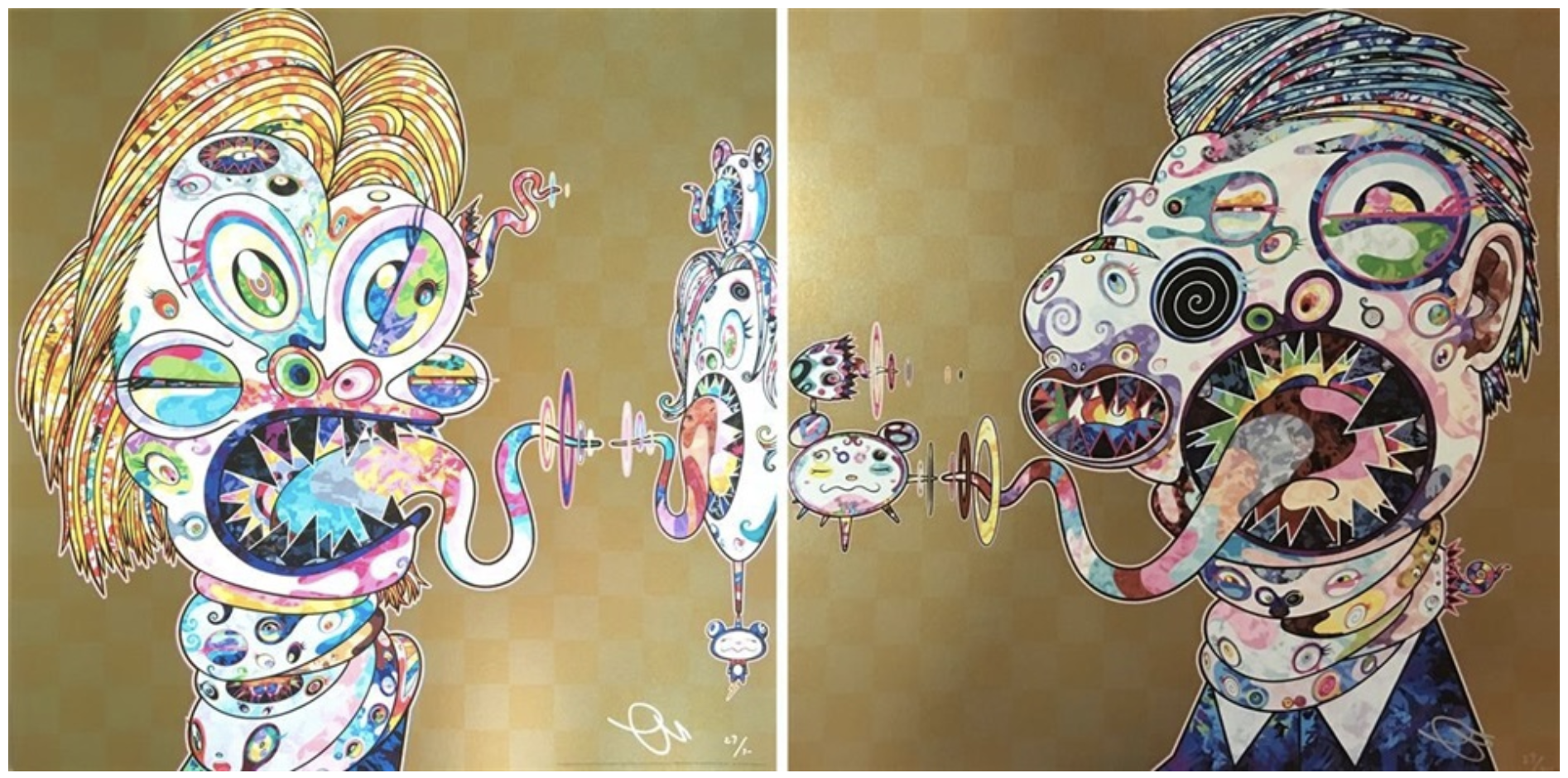
2004 Murakami Homage to Francis Bacon
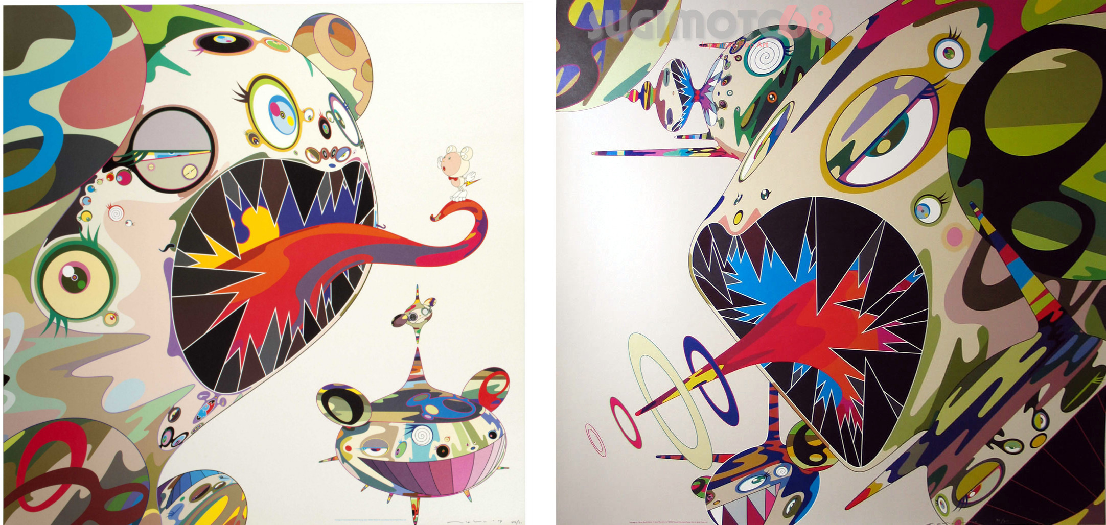
2004 Murakami Homage to Francis Bacon: Study of George Dyer & Study of Isabel Rawsthorne
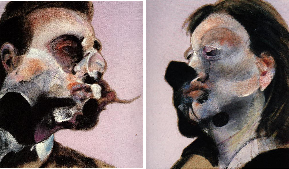
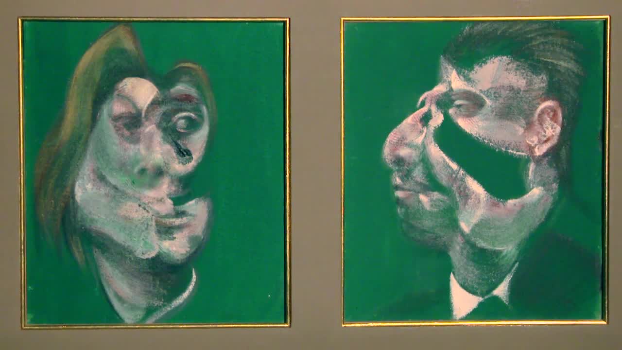
1970 Francis Bacon Studies of George Dyer and Isabel Rawsthorne
The first Homage to Francis Bacon prints debuted in 2004 with two offsets, modeled on Murakami paintings from the previous year. These images pay homage to the Francis Bacon Studies of George Dyer and Isabel Rawsthorne 1970 diptych. The first Murakami Bacons represent new variations of DOB that map with the silhouettes of the Bacon models. The swirl near the mouth of Bacon’s George is mirrored by Dob’s tongue in the Murakami George. The shadow-like black projected at the lower part of the head of Bacon’s Isabel has a reflection in the open mouth of the Murakami Isabel. The standard Murakami prints have a white backdrop but there is a gray backdrop variant of George that was only sold as part of a special limited edition set released in a New Year’s lottery sale at the end of 2004.
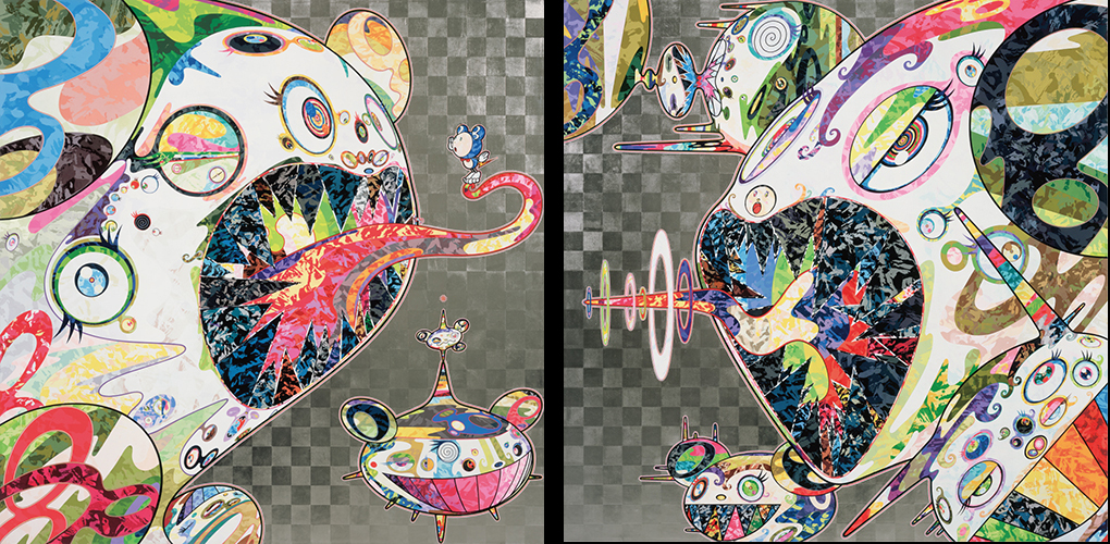
2012 Homage to Francis Bacon
2012 Murakami Homage to Francis Bacon: Study of George Dyer & Study of Isabel Rawsthorne
It appeared for a long time that these unique Murakami Dobs would never appear again; however in 2012, Murakami released the very luxe silkscreen versions of the Bacon prints. Murakami embellishes George with a platinum leaf backdrop and Isabel with a gold one.
2016 Study for Head of Isabel Rawsthorne and George Dyer
1967 Francis Bacon’s Study for Head of Isabel Rawsthorne and George Dyer
2016 Homage to Francis Bacon, Study for Head of Isabel Rawsthorne and George Dyer [gold]
2016 Homage to Francis Bacon, Study for Head of Isabel Rawsthorne and George Dyer
Later in 2016, Murakami premiered on instagram his new Bacon creations. These new pieces adhered more literally to their Francis Bacon counterparts, Study for Head of Isabel Rawsthorne and George Dyer 1967, and incorporate Murakami colors and stylistic flourishes. The mouths in the Murakami creations represent the gaps in the heads of Bacon’s originals. These pieces were later introduced in two pairs of new offset prints in 2016 under the title, Homage to Francis Bacon, Study for Head of Isabel Rawsthorne and George Dyer. Interestingly, this name appears on both prints, although each one represents a different portrait–basically the name emphasizes the set as a Murakami diptych. One set has Isabel with a colorful orange backdrop and George surrounded by a gray background highlighted with purple. The other set bears Murakami’s gold cold stamp backdrop.
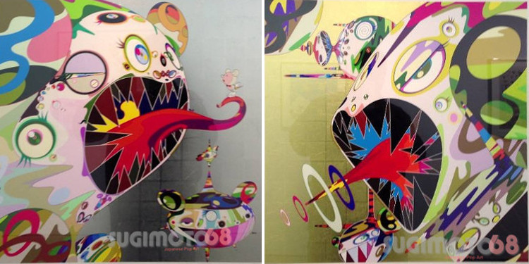
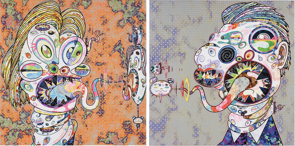
2017 Homage to Francis Bacon
2017 Murakami Homage to Francis Bacon: Study of George Dyer & Study of Isabel Rawsthorne
Finally in 2017, Murakami announced the release of a new version of his iconic Bacon prints from 2004. The newest versions have the shiny cold stamp backdrop and a sort of watercolor like coloration.
Reception
Similarly to the 727 prints, over time the original 2004 Murakami Homage to Bacon prints became popular and hard to find. Similarly, the silkscreen and 2017 incarnations seem to have a growing popularity as well.
The original 2004 Bacon images are among my favorite Murakami representations. They reference Bacon in a non-literal way, and the Murakami George reintroduces the ‘tiny relative to other characters scaled’ Dob character seen in Murakami’s Kerotan print from 2001. Ultimately, the silkscreen versions of Homage to Bacon are my favorites in the series–the gold and platinum backgrounds make the white Dob’s really pop. Admittedly the silkscreens are not very accessible prints at around $5,000 each, although worth it if you can afford to hang over $10K on your walls.
As for Murakami’s Study for Head of Isabel Rawsthorne and George Dyer 2016, I feel less partial to them. Adherence to a more anthropomorphic version of the original series makes the new pieces feel somewhat grotesque–the new versions are too literal. The understated colors of the original Bacon masterpieces make them stylistically consistent and appealing; whereas the sunny Murakami palettes create a clash between Bacon’s more intuitive design. I think I will grow to appreciate the new versions over time— as abstractions they seem somewhat stronger than the Dob Bacons. Ultimately, many people, with more sophisticated pallets, seem to really dig the new versions of Bacon as the demand for the gold set is strong.
In any event any combination of the Bacon pieces can add meaningful variety to your Murakami collection. Happy hunting!